Have you ever hesitated on a button that said "Blue Confirm" instead of "Confirm"? Or clicked a "Green Save" option only to wonder if green actually means save? Color naming in UX copy isn't just about aesthetics—it's a subtle psychological trigger. Colors evoke emotions, cultural associations, and even expectations. Red might signal urgency (like "Danger"), while blue often conveys trust ("Secure Checkout"). But when we name colors directly in copy—"Red Submit" or "Yellow Warning"—we risk confusing users who don't see the color at all (e.g., screen readers) or who interpret color differently. The challenge? Balancing clarity with creativity without alienating users who rely on language over visuals.
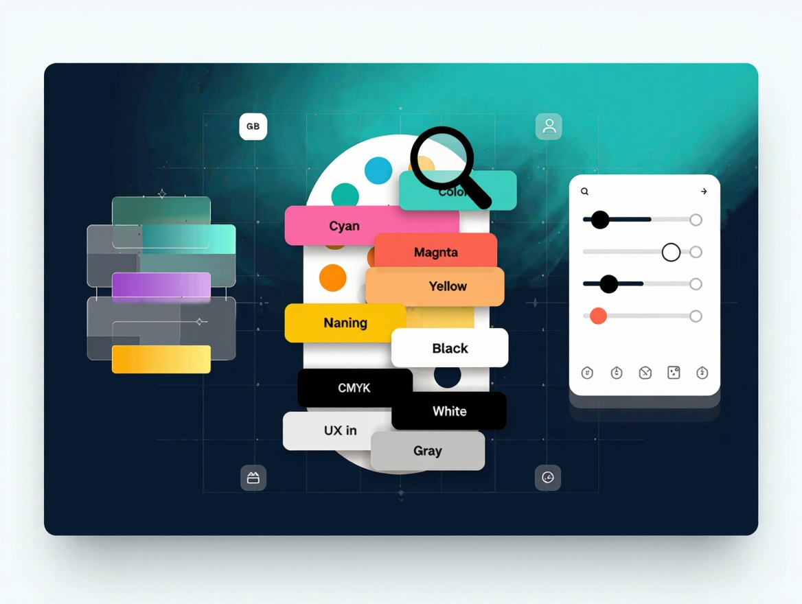
The Fine Line Between Clarity and Confusion
Effective color naming walks a tightrope. Too vague, and users feel lost ("Click the colored button"). Too literal, and you add noise ("Select the blue-themed option"). Take social media platforms: Instagram's "Blue Post" button fails where Facebook's "Share" succeeds. Why? Language-focused users crave action-oriented terms. Yet context matters. In design tools, naming colors might be essential: "Adjust Cyan Overlay" vs. "Adjust Overlay". The key? Contextual relevance. If users interact with color as a tool (e.g., editing software), naming it is logical. If color is decorative (e.g., a red link), prioritize clarity over specificity.
Accessibility: The Overlooked Audience
Color naming isn't just about design—it's a lifeline for accessibility. Blind or low-vision users rely on screen readers to interpret color names, but vague terms like "Green Button" become meaningless. Take a green button labeled "Submit" versus "Green Submit". Screen readers might announce "Green Submit button", which adds cognitive load. The solution? Action verbs paired with color only when necessary. For example, "Confirm (green)" provides context without redundancy. Similarly, colorblind users—though they see colors—may misinterpret hues. Naming them explicitly (e.g., "Blue (Primary) Action Button") ensures clarity across all audiences. Remember: accessibility isn't a niche concern; it's a universal design principle.
Real-World Case Studies
Let's dissect two real-world examples. Airbnb's app uses color sparingly in copy. Instead of "Book (Orange) Now", it defaults to "Book Now" with orange as a visual accent. This keeps focus on action over color. Contrast this with a lesser-known e-commerce platform that labeled buttons "Red Add to Cart", causing confusion when site themes changed colors. Users abandoned carts, frustrated by mismatched expectations. Another example: Figma, a design tool, uses color naming strategically. Its "Fill with Red" tool references color explicitly, as users interact with it as a tool. Here, contextual relevance justifies naming. The takeaway? Context dictates naming. When color is a function (editing, customization), mention it. When it's decorative, hide it.
Best Practices for Color Naming
So, how do you get it right? First, prioritize action over color. Label buttons with verbs: "Save", "Delete", "Cancel"—not "Green Save". Second, use color only when it adds value. In a theme selector, "Dark Mode (Gray)" clarifies intent. Third, test with diverse audiences. Run user interviews asking: "If this button were blue, would you still understand its purpose?" Fourth, adopt inclusive language. Avoid terms like "normal text" (which marginalizes dyslexic users). Instead, use "Primary Text". Finally, document color naming conventions. Teams using design systems (like Material Design) should define when color references are allowed. Remember: color naming isn't about creativity—it's about reducing friction.
The Future of Color Naming
As AI-driven interfaces emerge, color naming evolves. Voice assistants might say "Press the red button"—but what if it's orange today? Future designers must decouple color from action. Enter "Status Indicators": labels like "Active" or "Inactive" replace color names. Personalization also plays a role. A user toggling between themes should see consistent language, not shifting color labels. The goal? Design for the user's context, not the designer's palette. As UX grows more inclusive, color naming will shift from decorative tools to universal language—where clarity wins over creativity every time.