In the world of design and printing, color is everything. From the vibrant red of Coca-Cola to the distinctive Tiffany blue, brands rely on specific shades to create recognition and emotional connection. The Pantone Matching System (PMS) has long been the gold standard for identifying and reproducing exact colors in print. However, with the rise of digital media, designers increasingly need to translate these spot colors into CMYK for printing or RGB for digital displays. Understanding how to convert Pantone colors accurately can save you time, money, and countless headaches throughout the design process.
Understanding Color Systems
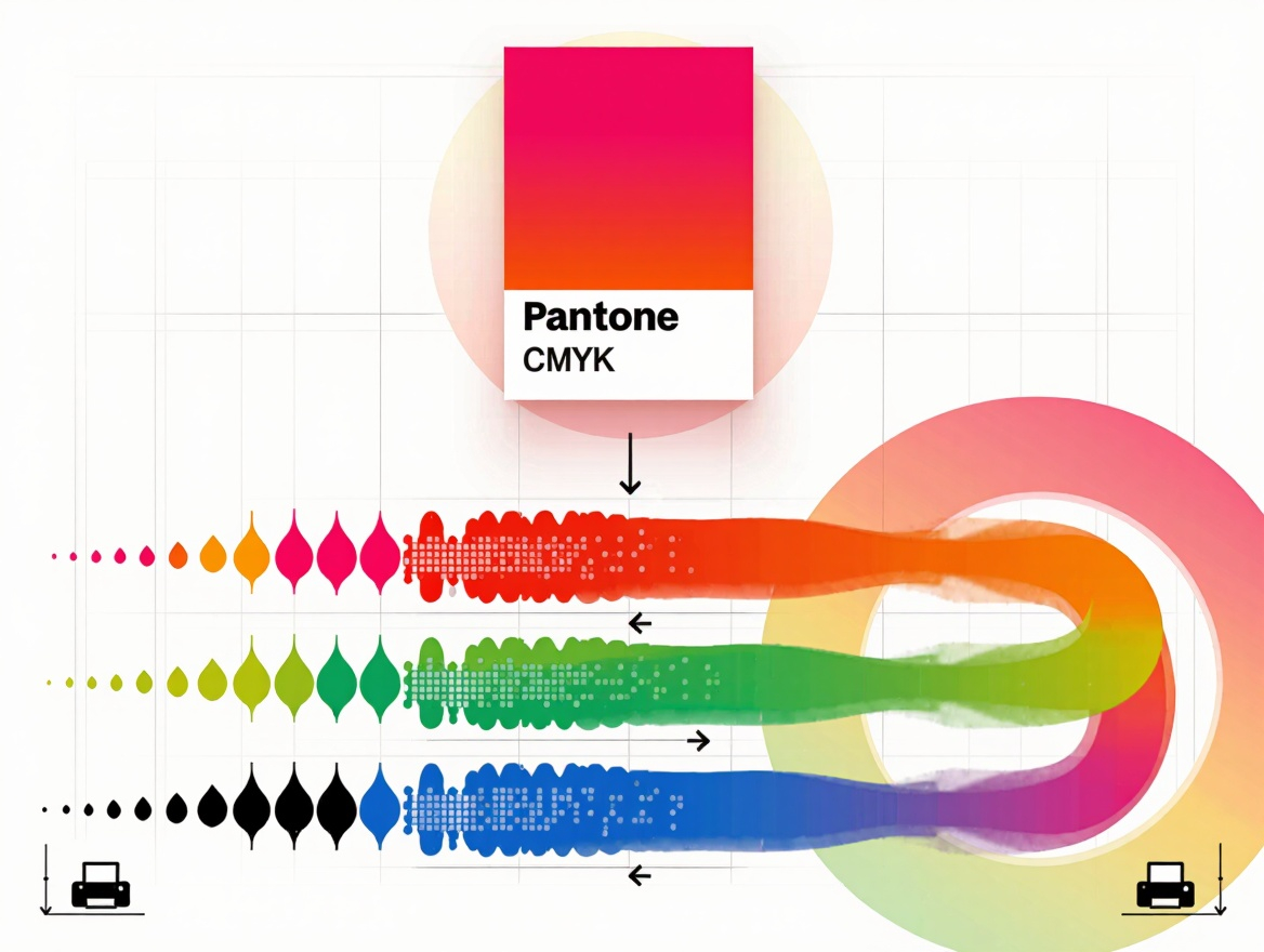
To grasp the challenges of color conversion, we must first understand how different color systems work. Pantone, or PMS, is a spot color system that uses numbered formulas to create precise, pre-mixed inks. When you specify Pantone 185 C, for example, you're instructing the printer to use the exact formula for that specific red. This system ensures consistency across different print jobs and locations.
CMYK, on the other hand, is a subtractive color model used in four-color process printing. It represents colors using a combination of Cyan, Magenta, Yellow, and Black inks. The more ink you add, the darker the color becomes. This system works well for reproducing photographs and complex images but has limitations when trying to match specific, vibrant Pantone colors.
RGB is an additive color model used for digital displays. It combines Red, Green, and Blue light at different intensities to create colors. This system works perfectly for screens but translates poorly to print, as it has a different color gamut—the range of colors it can reproduce. Understanding these fundamental differences is the first step toward successful color conversion.
The Science Behind Color Conversion
Color conversion isn't as simple as finding a one-to-one match between color systems. At its core, it involves translating numerical values from one color space to another, taking into account the unique characteristics of each system.
The mathematical models used for conversion, such as ICC profiles, attempt to map colors from one gamut to another. However, since different color systems have different gamuts—RGB can display some vibrant colors that CMYK cannot print, and Pantone colors exist outside both gamuts—some colors simply cannot be replicated perfectly. This is why you often see shifts when converting a Pantone color to CMYK or RGB.
Modern color management systems use sophisticated algorithms to minimize these shifts, but they can't eliminate them entirely. The goal is not always a perfect match but finding the closest possible representation while maintaining the intended feel and impact of the original color.
Converting Pantone to CMYK
When converting Pantone colors to CMYK, the process typically involves using software like Adobe Photoshop, Illustrator, or InDesign. These applications include built-in Pantone color libraries and conversion tools.
The conversion process works by analyzing the Pantone color and finding the closest combination of CMYK values that approximates it. For example, Pantone 200 C might convert to CMYK values of C:0, M:100, Y:90, K:10. This combination of inks will produce a color visually similar to the original Pantone swatch.
However, not all Pantone colors convert equally well. Bright, saturated colors are particularly challenging to reproduce in CMYK because they often fall outside the CMYK gamut. Metallic and special-effect Pantone colors cannot be accurately represented in standard CMYK at all, as they require metallic inks or other special printing processes.
To minimize conversion issues, consider these strategies. Always start with the most recent Pantone color guides, as colors may shift over time. Consult with your printer early in the process, as they can provide insights based on their specific equipment and inks. Be prepared to adjust the CMYK values manually if the initial conversion doesn't meet your standards. When possible, use Pantone colors that fall within the CMYK gamut for critical elements.
Converting Pantone to RGB
Converting Pantone colors to RGB follows a similar process but with different considerations. RGB has a wider gamut than CMYK, so most Pantone colors can be reasonably approximated for digital use.
In Adobe applications, you can simply select a Pantone color and change the color mode to RGB. The software will calculate the closest RGB values. For example, Pantone 2726 C might convert to RGB values of R:0, G:51, B:153.
While RGB conversions are generally more successful than CMYK conversions, there are still challenges to consider. Different screens display colors differently due to variations in calibration and technology. RGB colors can appear different when converted back to print. Some Pantone colors, particularly those with metallic or fluorescent properties, have no good RGB equivalent.
To ensure your digital designs maintain color integrity, calibrate your monitors regularly. Test colors on multiple devices when possible. Consider creating separate RGB color palettes for digital applications rather than relying solely on Pantone conversions. Document your RGB conversions for future consistency.
Best Practices for Color Conversion
Successful color conversion requires both technical knowledge and practical experience. Here are some best practices to follow.
Plan Ahead\ Determine early in your project which color systems you'll need and which elements must match exactly.
Communicate with Your Printer\ Share your color conversion methods and expectations with your printing partner. They may have suggestions based on their specific equipment and processes.
Always Proof\ Print proofs are essential for verifying color accuracy before production runs. Don't rely solely on digital proofs.
Document Your Process\ Keep records of the Pantone colors you convert and the CMYK/RGB values you use. This documentation ensures consistency across projects and helps you troubleshoot issues if they arise.
Consider Hybrid Approaches\ For projects that require both digital and print versions, consider creating separate but coordinated color palettes rather than forcing exact conversions.
Stay Updated\ Color spaces and conversion methods evolve. Stay informed about new tools and techniques as they become available.
The Future of Color Conversion
As technology advances, the accuracy of color conversion continues to improve. New color management systems, more sophisticated algorithms, and enhanced printer capabilities are reducing the gap between spot colors and process colors.
Emerging technologies like spectral color measurement promise to revolutionize how we define, convert, and reproduce colors. Unlike traditional color models that define colors based on RGB or CMYK values, spectral color measurement captures the full spectrum of light reflected by a color, potentially eliminating many of the current limitations in color conversion.
In the meantime, the most successful designers will be those who understand both the technical aspects of color conversion and the practical realities of different media. By setting realistic expectations, communicating effectively with production partners, and embracing both digital and analog color systems, designers can ensure their work maintains its intended impact across all platforms.
Conclusion
Converting Pantone colors to CMYK or RGB is both an art and a science. While technological advances continue to improve the accuracy of these conversions, understanding the fundamental differences between color systems and their limitations remains essential for any designer working across print and digital media.
By following best practices, communicating with production partners, and setting realistic expectations, you can minimize color shifts and ensure your designs maintain their visual integrity. Remember that the goal isn't always a perfect match but finding the closest possible representation that preserves the intended feel and impact of your original color choices.
As technology continues to evolve, so too will our ability to translate colors between different systems. Until then, a combination of technical knowledge, practical experience, and clear communication will remain your most valuable tools in the quest for color consistency. After all, in design as in life, it's often the subtle differences that make all the difference.