In the digital age, typefaces surround us yet often go unnoticed—until they don't work. The art of typography bridges the gap between communication and aesthetics, creating invisible threads that tie our visual world together. Crafting a typeface is a journey that transforms abstract ideas into tangible tools for expression, requiring equal measures of artistic vision and technical precision.
The process of creating a typeface is both methodical and creative, demanding patience, attention to detail, and a deep understanding of how letters communicate. This workflow takes us from initial spark to finished product, exploring the steps that transform a mere concept into a fully functional type system ready to serve its purpose in the world.
Sketching & Concept Development
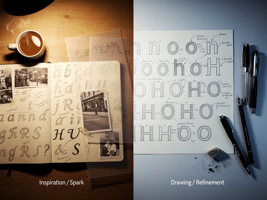
Every typeface begins with an idea, often born from a specific need or aesthetic vision. The initial phase involves extensive sketching and exploration, where designers translate abstract concepts into tangible forms. This stage is crucial, as it establishes the personality and purpose of the typeface.
Designers typically begin with hand sketches, allowing for organic exploration of forms without the constraints of digital tools. These sketches might explore historical references, contemporary trends, or entirely original directions. The goal is to develop a distinctive yet functional voice that will serve the typeface's intended purpose—whether for body text, headlines, or decorative purposes.
During this phase, designers create mood boards, study existing typefaces, and experiment with different weights and styles. The most successful concepts emerge from this research, balancing innovation with practicality. The sketches that survive this rigorous vetting process will form the foundation of the typeface's identity.
Creating the Masters
With a concept direction established, the next phase involves translating sketches into digital masters. This typically begins with creating the most essential characters—often the alphabet, numerals, and common punctuation marks.
Designers employ vector software to carefully construct each glyph, ensuring precision and consistency. The process requires meticulous attention to detail, as even subtle variations can affect the overall harmony of the typeface. Many designers work at a large magnification to maintain control over every curve and line.
The creation of masters involves establishing a system that will guide the design of all subsequent characters. This includes defining the x-height, cap height, baseline, and other structural elements that will maintain consistency across the typeface. The masters serve as the foundation from which all other characters will be derived, making this one of the most critical stages in the workflow.
Spacing & Kerning
Once the basic character forms are complete, attention turns to spacing and kerning—the invisible architecture that makes typefaces functional and beautiful. Proper spacing ensures that characters appear visually equidistant from each other, while kerning adjusts the space between specific character pairs.
The process begins with setting metrics—defining the side bearings (the space on each side of a character) that will create a consistent rhythm across the typeface. Designers must make optical adjustments, as what appears mathematically equal doesn't always look balanced to the human eye.
Kerning addresses the specific relationships between characters, adjusting the space between letter combinations like "AV" or "To" to create a visually pleasing flow. This is an incredibly time-consuming process that requires both technical skill and aesthetic judgment. Proper kerning transforms a mechanical set of glyphs into a harmonious, readable typeface.
Testing & Refinement
With the characters spaced and kerned, the typeface enters the testing phase, where it's evaluated in various contexts to ensure functionality and readability. Designers test the typeface at different sizes, in different applications, and across different languages and writing systems.
This testing phase often reveals issues that weren't apparent during the design process—unexpected collisions, inconsistent spacing, or characters that don't work in certain combinations. Designers meticulously document these issues, creating a roadmap for refinement.
The refinement process involves going back to the masters to adjust problem characters, then re-spacing and kerning as necessary. This iterative cycle of testing and refining continues until the typeface performs consistently across all intended applications. Only then is the typeface ready for release into the world.
Conclusion
Creating a typeface is a journey that transforms an abstract concept into a functional tool for communication. It requires equal measures of artistic vision and technical precision, blending the intuitive with the methodical. From initial sketches to final refinements, each step builds upon the last, creating a cohesive system that serves its purpose with elegance and efficiency.
The next time you encounter a well-designed typeface, take a moment to appreciate the thought and care that went into its creation. Behind every character is a story of creativity, problem-solving, and dedication—a testament to the power of typography to shape our visual world and enhance our communication.