The Hebrew script, with its elegant right-to-left (RTL) orientation, presents unique challenges and considerations in the world of typesetting and design. As one of the oldest continuously used alphabets, Hebrew writing has evolved over millennia, but its fundamental RTL direction remains a defining characteristic. In our increasingly global digital landscape, understanding how to properly handle Hebrew typesetting has become crucial for designers, developers, and content creators who aim to communicate effectively with Hebrew-speaking audiences. This article explores the intricacies of Hebrew typesetting, from script characteristics to technical implementation, offering insights into creating beautifully typeset Hebrew content.
The Hebrew Writing System
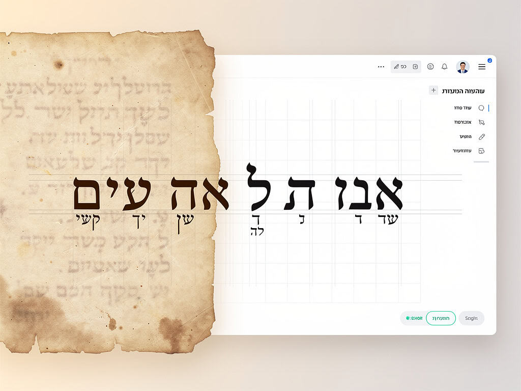
Hebrew is an abjad script, primarily consisting of consonants, with vowel marks typically appearing as diacritics (known as niqqud) that can be used in educational, religious, or poetry contexts but are often omitted in everyday writing. The script contains 22 basic letters, five of which have different forms when appearing at the end of a word. This distinctive feature, known as "final forms" or "sofit" letters, adds complexity to Hebrew typesetting.
The RTL direction of Hebrew presents the most obvious challenge for those accustomed to left-to-right (LTR) scripts. Unlike English where text begins at the top-left of a page and flows left-to-right, Hebrew text begins at the top-right and flows right-to-left. This fundamental difference affects everything from paragraph construction to the placement of punctuation and numbers.
Technical Challenges in RTL Typesetting
One of the primary challenges in RTL typesetting is handling mixed-direction content. In modern Hebrew texts, it's common to encounter LTR elements such as numbers, Latin-based acronyms, or English phrases within Hebrew sentences. Proper handling of these "bidi" (bidirectional) text elements requires careful consideration to avoid awkward or confusing layouts.
Paragraph construction in RTL typesetting follows different principles than in LTR scripts. In Hebrew, the first line of a paragraph typically begins at the right margin, with subsequent lines flowing leftward. When a paragraph ends with a line break, the next paragraph continues from the right margin again. This creates a distinctive "reversed" indentation pattern that designers must accommodate.
Punctuation in Hebrew also follows RTL conventions. Question marks, exclamation marks, and periods appear at the beginning of sentences rather than at the end. Commas, semicolons, and colons also maintain their RTL positioning, which can be disorienting for those unfamiliar with the script.
Font Considerations for Hebrew
Designing or selecting appropriate fonts for Hebrew typesetting requires attention to several specific considerations. Hebrew fonts must properly handle the final forms of letters, ensuring they appear correctly when positioned at word endings. Additionally, Hebrew letters often have distinctive characteristics—such as ascenders and descenders—that affect line spacing and overall vertical rhythm.
OpenType technology has revolutionized Hebrew typesetting by providing advanced features for handling complex script behaviors. These features include proper positioning of vowel points, contextual alternates for letters in different positions, and ligatures that connect letters for aesthetic or readability purposes.
When working with Hebrew fonts, it's essential to consider the balance between traditional calligraphic forms and modern readability. While some Hebrew fonts evoke ancient manuscripts, others prioritize contemporary clarity, especially for digital display where screen resolution and pixel alignment play crucial roles.
Modern Solutions for RTL Typesetting
Contemporary web technologies have made significant strides in supporting RTL typesetting. CSS provides the direction property, which allows developers to specify text direction with simple declarations. The unicode-bidi property offers additional control over bidirectional text handling, enabling sophisticated mixing of LTR and RTL content.
Unicode standards have also facilitated Hebrew typesetting by providing dedicated code points for Hebrew characters, vowel points, and various punctuation marks. This standardization ensures consistency across different platforms and applications.
Modern typesetting software, including Adobe InDesign and professional font editors, now includes robust Hebrew support with features like automatic final form application, proper text flow, and sophisticated justification algorithms tailored to Hebrew script characteristics.
Conclusion
Hebrew typesetting, with its right-to-left orientation and unique script characteristics, presents both challenges and opportunities for designers and developers. By understanding the fundamental differences between RTL and LTR writing systems, appreciating the technical requirements for proper Hebrew display, and leveraging modern technologies designed for bidirectional text, creators can produce content that honors the beauty and functionality of Hebrew script.
As our digital world becomes increasingly multilingual, the importance of proper Hebrew typesetting will only grow. Whether creating websites, books, or mobile applications, attention to the nuances of RTL typesetting ensures that Hebrew text appears as intended—clear, readable, and aesthetically pleasing. In a global context where cross-cultural communication is paramount, mastering Hebrew typesetting represents not just a technical skill, but a mark of respect for one of the world's most ancient and enduring writing systems.