Dyslexia affects approximately 10-15% of the population worldwide, creating challenges with reading and processing written language. Typography choices can significantly impact readability for people with dyslexia. Evidence-based adjustments to font characteristics, spacing, and layout can make text more accessible.
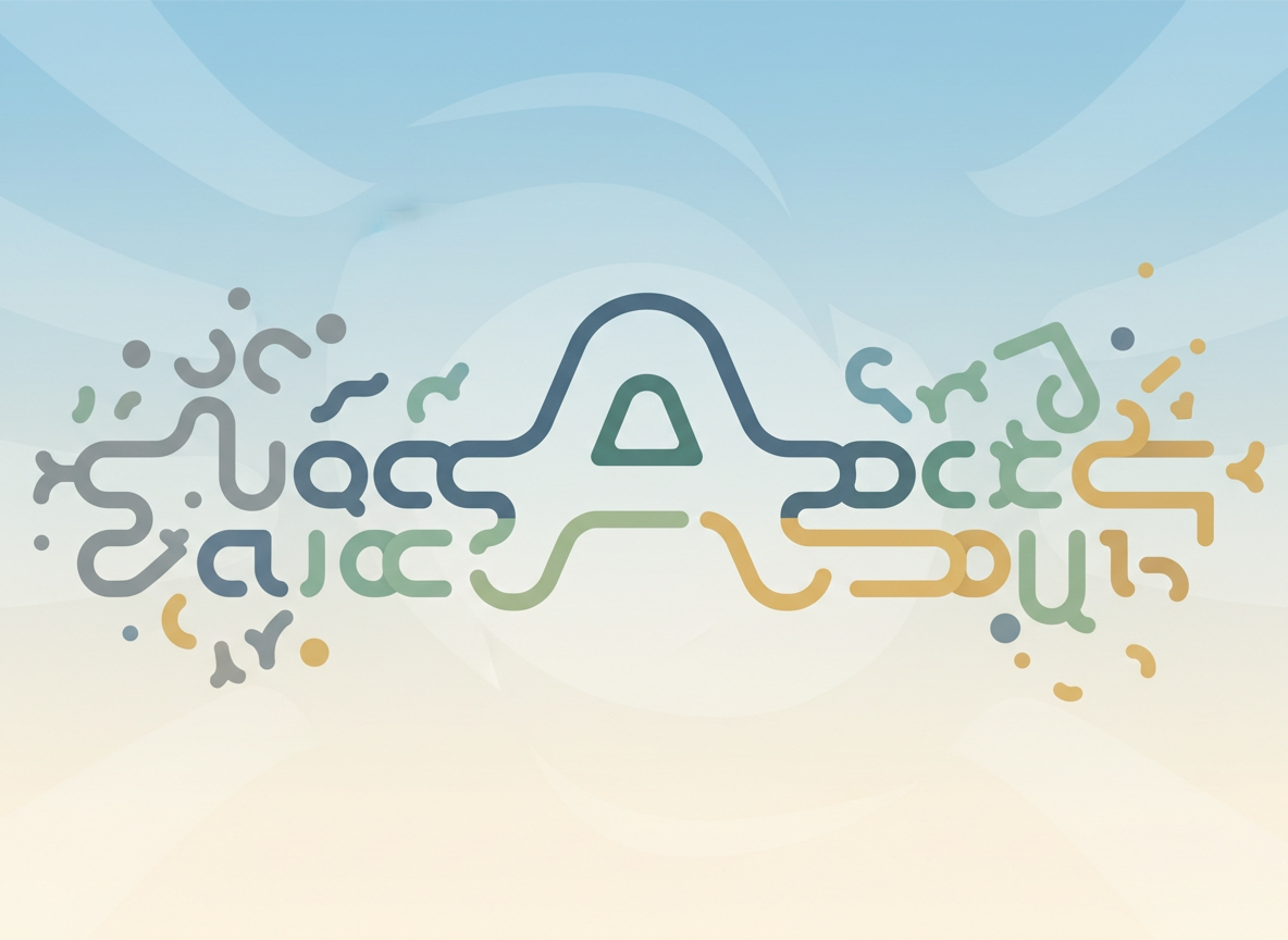
Understanding Dyslexia
Dyslexia is a neurobiological learning difference characterized by difficulties with accurate and/or fluent word recognition and poor spelling and decoding abilities. These challenges typically result from a deficit in the phonological component of language. The British Dyslexia Association notes that dyslexia exists on a spectrum and can affect individuals differently. Contrary to common misconceptions, dyslexia is not related to intelligence, but rather to how the brain processes written language.
Common Misconceptions
Several myths persist about dyslexia-friendly typography. One common misconception is that all sans-serif fonts are better for people with dyslexia. Research by B. A. Boyle et al. (2012) suggests this is not necessarily true. What matters more are specific letter characteristics rather than font classification. Another myth is that dyslexia-friendly typography benefits only people with dyslexia. In reality, many of these principles improve readability for all readers, especially in challenging reading conditions.
Font Characteristics
Certain typographic features can significantly impact readability for people with dyslexia. Letterform distinctness matters most. Letters should have clearly distinguishable shapes to avoid confusion between similar characters. For example, 'a' and 'o' should be easily distinguishable, as should 'b', 'd', 'p', and 'q'.
Letter weight also influences readability. Consistent stroke weight helps prevent letters from appearing to blend together. A study from the University of Twente found that medium-weight fonts performed better than very light or very heavy weights.
X-height provides another important consideration. A larger x-height (the height of lowercase letters) can improve readability. Letters like 'a', 'e', and 'o' become more distinct, reducing visual confusion.
Open letterforms complete the key characteristics. Letters with more open shapes (like 'c', 'e', and 's') are easier to distinguish than closed or partially closed forms.
Recommended Fonts
Several fonts have been designed or modified specifically for dyslexia. Dyslexia font was created by Christian Boer with heavier bottoms on letters to prevent readers from flipping them. OpenDyslexic, designed by Abelardo Gonzalez, uses unique bottom-heavy letter shapes to prevent confusion and increases spacing between letters, lines, and word spacing.
Arial, while not specifically designed for dyslexia, has clear, distinct letterforms and consistent spacing, making it a reasonable choice. Comic Sans, though controversial due to its informal appearance, showed improved reading accuracy and speed for children with dyslexia in research from the University of Amsterdam.
Practical Implementation
When creating dyslexia-friendly typography, consider font size first. Use larger font sizes (14-16pt for body text) to reduce crowding. Line spacing should be increased to 1.5 or double spacing to help with tracking lines.
Line length affects reading comfort. Keep lines to 50-75 characters to prevent readers from losing their place. Color contrast ensures sufficient visibility between text and background. Avoid bright backgrounds with dark text, which can cause visual stress.
Justification deserves special attention. Avoid fully justified text, which creates irregular spacing between words. Left-aligned text with a ragged right edge provides more consistent word spacing.
Conclusion
Typography choices can significantly impact readability for people with dyslexia. By focusing on evidence-based design principles rather than following common misconceptions, content creators can make text more accessible. The benefits of these approaches extend beyond the dyslexic community, improving reading experiences for everyone. As we continue to understand how typography affects reading, these principles will likely evolve, but the core goal remains the same: making text accessible to all readers.